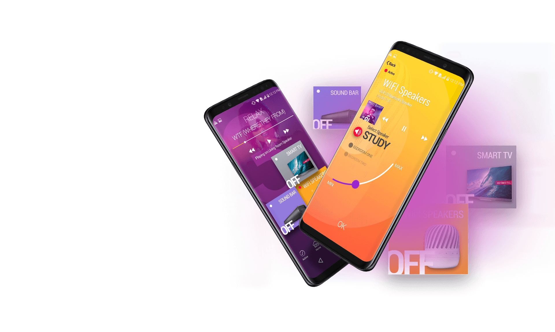

fun new Smart
Home App
Interaction design was key in creating a
dynamic and intuitive motion experience.
The Challenge
The focus of creating this Smart Home app was to develop an interesting fun and engaging user experience. Interaction design was key in creating an exciting motion experience. Simple shapes, combined with strong colours and fonts, would help create a continued engagement with appliances on a second screen.
We wanted to experiment how we could combine colour, simple shapes and bold font use to develop an app experience which is:
- Engaging
- Playful
- Simple
The Result
UX/UI concept design for a fun new Smart Home App.
Pair Up
Simply pair an appliance
to get started.
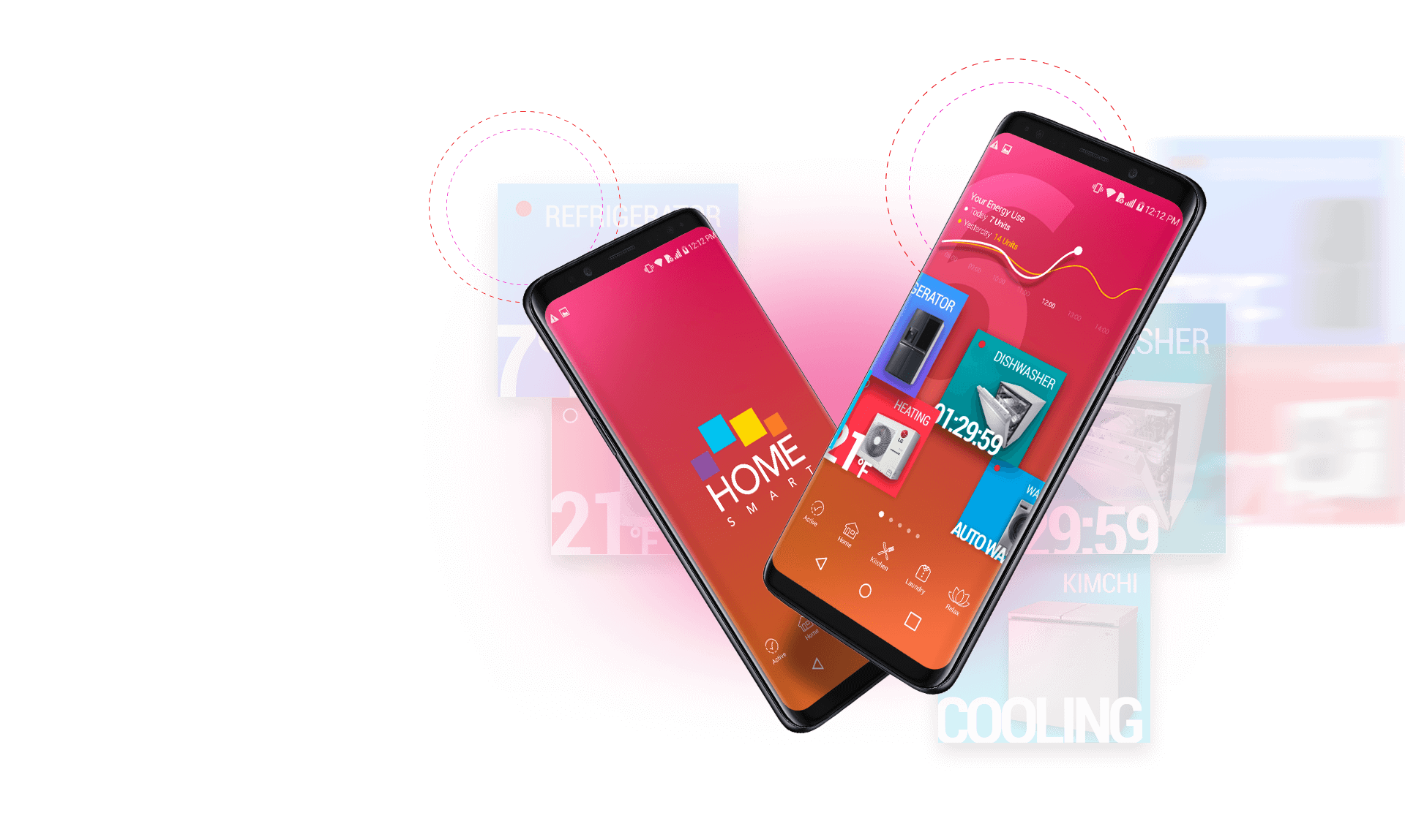
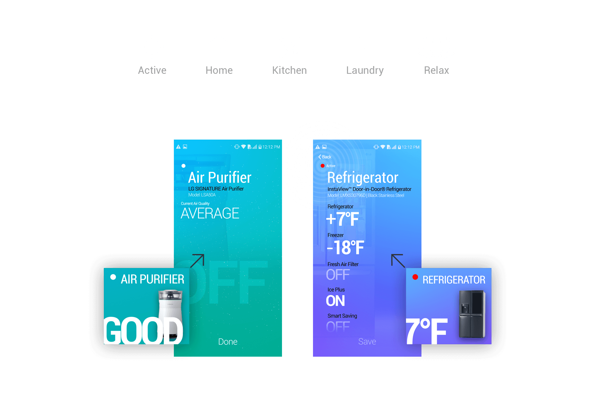
Just Swipe
Simply swipe through the appliance zones to
control individual appliances and products
you’ve set up.
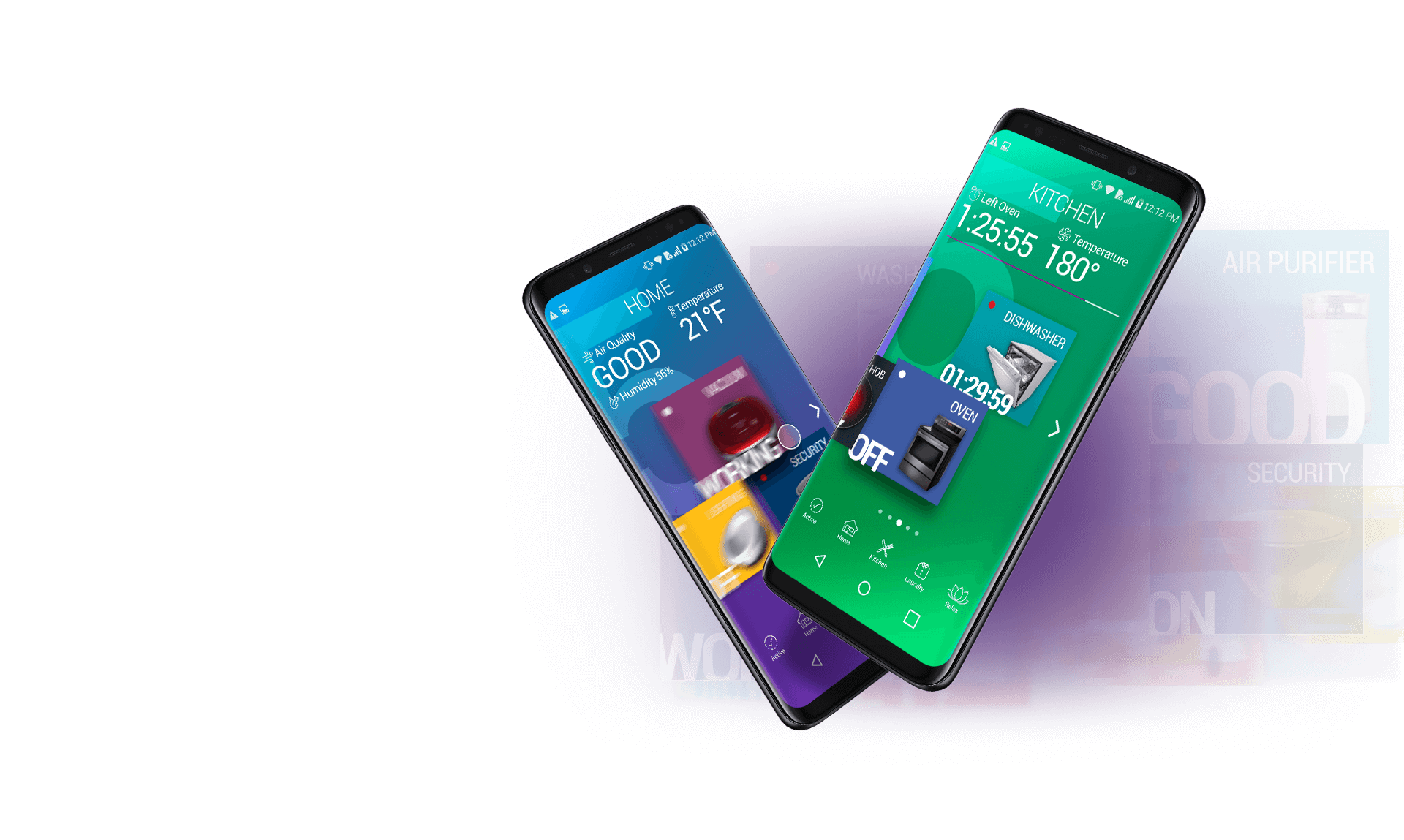
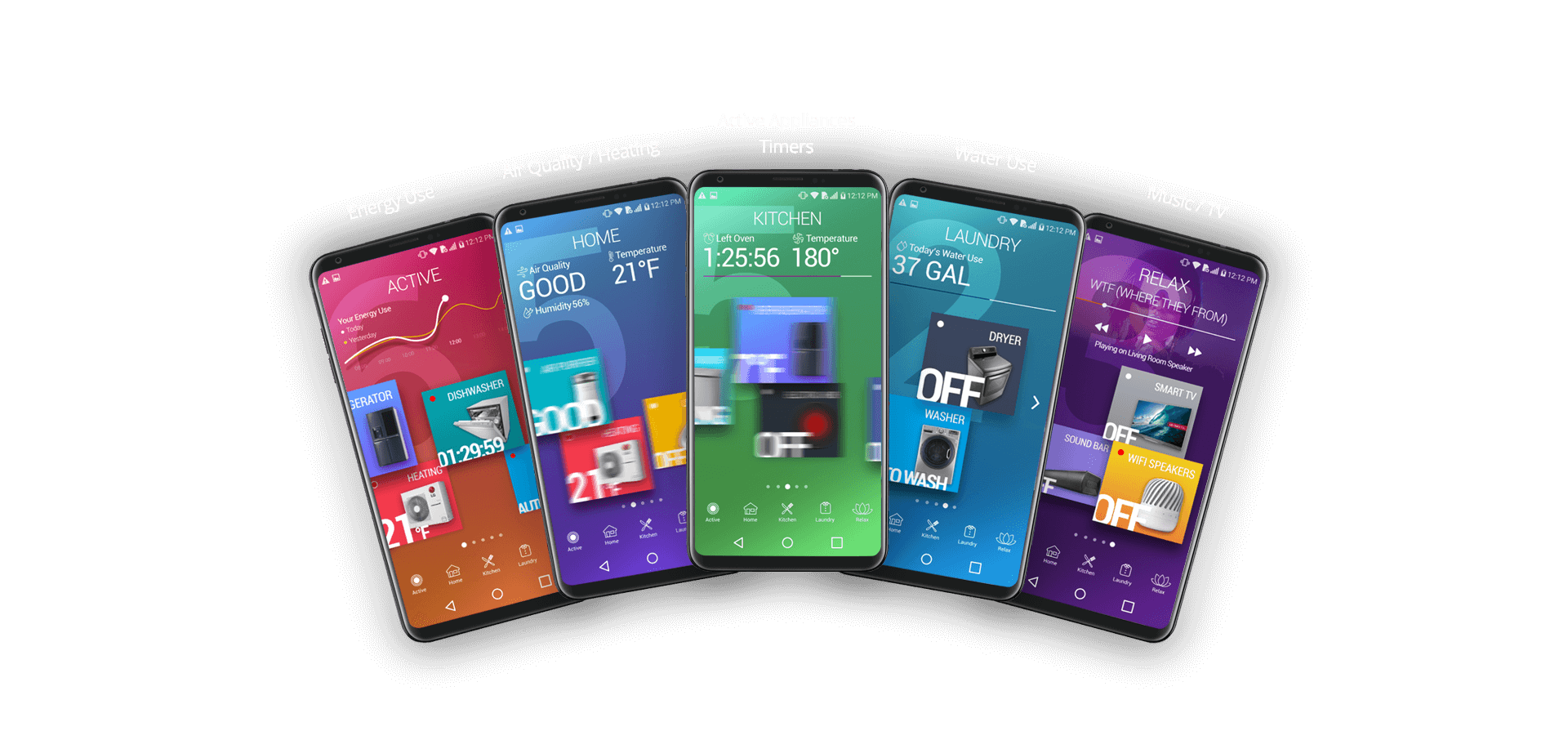
Header area of each section is used to display information .i.e energy
use, water use etc to keep you up to date with your general household
energy and utility use.
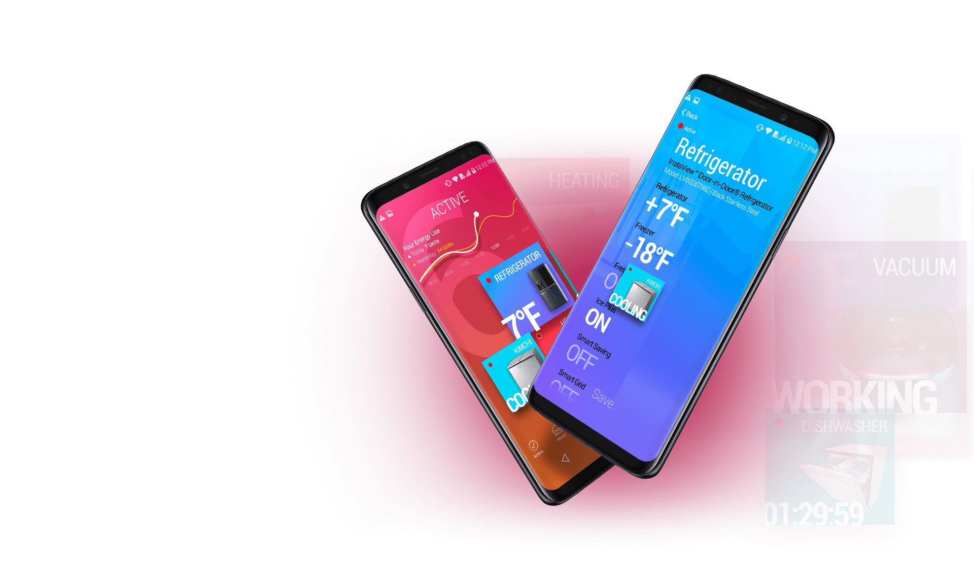
Active
This area give you a quick overview of what
appliances are currently running in your home.The
top area of the app is reserved to display your
daily/weekly and monthly energy use.
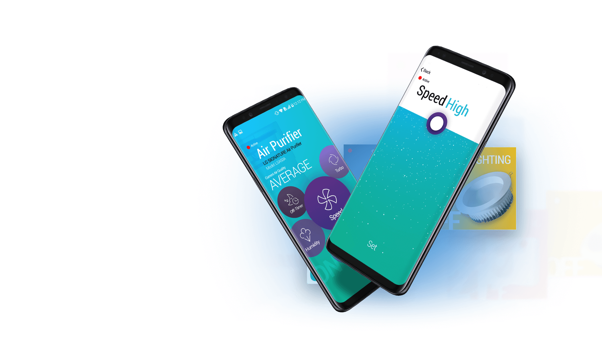
Home Comforts
Adjust the comfort of your home
environment in a fun, quick and
engaging way.
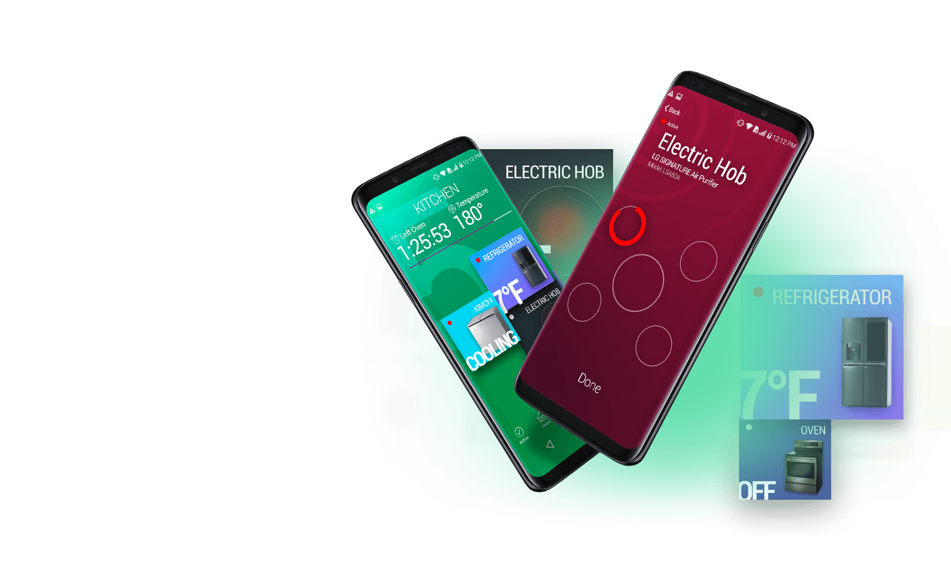
In The Kitchen
Cook from anywhere, preheat the oven before you
get home. Turn your dishwasher on at the most
economical time of the day even if you’re not home.
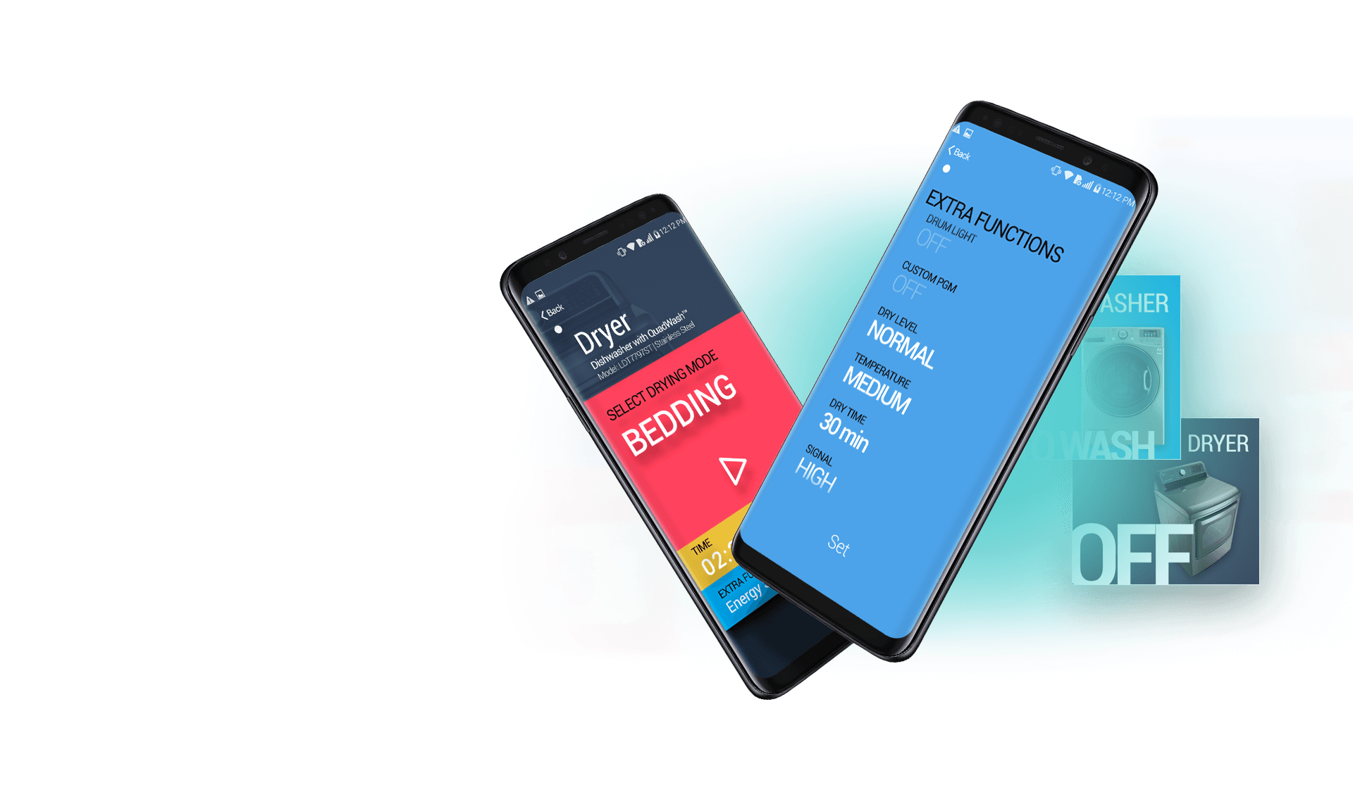
Wash & Dry
Control your laundry appliances from
your phone.Wash and dry your clothes
before you get home.
Relax
Control your smart TV or select which
WiFi speaker you’d like your music to
play from.
